
Introduction
The academic field of human-computer interaction (HCI) has grown considerably in the past two decades as mobile and desktop technologies are now used by and impact billions of people all around the world.
This course synthesizes key research findings, provides practical approaches to user interface (UI) prototyping, and a strong introduction to the design thinking process developed by the Hasso-Plattner Institute and Stanford University to create experiences that are grounded in observations of how real people use software products.
These course notes are summaries of key points in pre-lecture reading materials and lectures including key graphics and resources to better illustrate and aid in learning.
Note from the author: Please do note that these are my (Pramod’s) own notes and may not fully reflect the learning outcomes of James Landay’s course; however, I will do the best I can to write an introduction to HCI faithful to the teachings of James Landay and his wonderful staff of course assistants.
Course overview
The PDF screen-grab of the syllabus for this course is available here:
These course notes will consist of 10 major sections based on the organization of the two hour lecture periods over the ten week Stanford quarter.
- 1A: Introduction to HCI and a Techno-Realist Vision
- Design Thinking:
- Design Discovery (1B)
- Define (2A)
- Ideate (2B)
- Concept Videos (3B)
- Exploration (4A)
- Early Stage Prototyping (4B)
- Visual Information Design (5B)
- Early and Future Visions of HCI (6A)
- Human Abilities (6B)
- Heuristic Evaluation (7A)
- Conceptual Models and Interface Metaphors (7B)
- Usability Testing (9A)
- Design Patterns (9B)
- Smart Interfaces for Human-Centered AI (10B)
Let’s get into it!
HCI & a Techno-Realist Vision
What it means to innovate responsibly
Based on Margaret Gould Stewart’s “From techno-optimism to techno-realism: What it means to innovate responsibly”.
Stewart discusses how to innovate responsibly when building for a diverse and global community, as Facebook does. Unbridled technology-optimism isn’t a healthy approach to responsible innovation, i.e. the belief that technology advancements are always a net positive contribution to our world.
By leveraging a diverse set of perspectives, technology can empower people and should be developed collaboratively with the intended users. The technologies we deploy may unintentionally reinforce or amplify the pre-existing prejudices.
In designing new virtual assistant voices, Stewart’s Responsible Innovation team reflected early in the design process to challenge the status quo that a voice assistant should have a female persona and voice. This is a socially-aware lens applied to development.
Beyond the “target users” of a product, we should also consider who would be impacted by others’ use of the product via an expansive stakeholder analysis. This process is augmented by co-design wherein community members are treated as equal collaborators in the design process via a participatory approach. Participants were paid a “meaningful honorarium” for their engagement.
To empower people, reduce reinforcing existing societal biases, and improve the condition of others, technologies need to expand their scope of professional responsibility, as a digital urban planner of sorts.
AI & User experience design
Tesla’s autopilot feature requires UX design. The touchscreen requires your full attention to operate it, a mode ripe for multi-modal interactions involving more than one interaction mode (e.g., voice with a screen output, gestures to a voice output).

Image: Roberto Nickson, Unsplash
Smart speakers use a voice UI but do not provide a natural interaction with context and knowledge about the user. In general, what should we show to a user? Who are other stakeholders and what should they see from an AI system. Are there design patterns to support smart UIs?
Balancing design thinking & technology
A balance between human-centered approaches and technical approaches in CS/engineering. Design involves:
- Humans: the end users, cognition, vision, perception, motor abilities, etc.
- Tasks & Activities we want to support for the people we are designing for
- Technology: what users already have or new tech we might bring to them. This synthesis takes context in organizational and societal issues.
Design discovery and exploring ideas
The Design Thinking process is outlined to the right. Beyond a seemingly-linear process, there are loops or steps back in this process.

Five stage design thinking process
User experience goals include:
- Learnable: faster the second time
- Memorable: from session to session
- Flexible: multiple ways to do tasks
- Efficient: perform tasks quickly
- Robust: minimal error rates, good feedback so user can recover
- Discoverable: learn new features over time
- Pleasing: high user satisfaction
- Fun
User-centered design involves:
- Cognitive abilities: perception, physical manipulation, memory
- Organizational/education job abilities
- Keeping users involved throughout: developers working with target customers, think of the world in the users’ terms
Accessible design involves catering to:
- Different abilities: vision, hearing, cognitive, mobility (e.g., blind users with screen readers)
- Moral and ethical purpose: inclusive design benefits everyone (e.g., sidewalk curb cuts)
- Legal guidance: Americans with Disabilities Act (ADA) which includes websites and apps per the Department of Justice
Needfinding involves observing existing practices for inspiration making sure that key questions are answered including ethical questions in design with underserved communities. Needfinding transforms into sketching and storyboarding. Concept videos illustrate the context of the user rather than the specific UI, a relatively quick and inexpensive process that forces us to think about how the user will actually use the app.
Rapid prototyping & evaluation
Rapid prototypes allow us to build a mock-up of a design so it can be tested, typically taking the form of paper sketches or interactive tools like HTML, Balsamiq, Axure, proto.io, Sketch, Marvel, Modao, etc. UI builders include Expression Blend with Visual Studio, Xcode’s Interface Builder, etc. Test with real customers (“participants”) with an interactive prototype. Low-cost techniques involve expert evaluation (heuristic evaluation).
Design Discovery
Successful Brainstorming
Based on Susan Adams’s “4 Steps to Successful Brainstorming” [Adams 2013].
Adams found that most corporate executives put the cart before the horse: “Instead of parsing the objectives they hope to achieve, they direct their energy at coming up with solutions to broadly-stated problems.” Keeney argues that before brainstorming, it is important to analyze and focus on the objectives of the group. Keeney’s four steps to effective brainstorming are:
- Lay out the problem you want to solve. Identify the objectives, evaluate the alternatives (pushing until five such alternatives are found), and select the best option.
- Identify the objectives of a possible solution. Going into details about the requirements and not potential solutions makes the forthcoming brainstorming sessions more successful.
- Try to generate solutions individually. Before heading to the group, brainstorm solutions individually to avoid ‘anchoring’ to a particular solution/objective to the exclusion of other goals for the team.
- After the prior steps, work as a group. Use the objectives, problem statements, and individual solutions to facilitate a more productive brainstorming session.
Beyer, Contextual Design - Defining Customer-Centered Systems
Based on Hugh Beyer and Karen Holtzblatt’s Contextual Design - Defining Customer-Centered Systems.
Contextual inquiry is all about going to where the customer (i.e., “user” or “participant”) is, observing them, and talking to them about their work. A relationship model suggests that the appropriate behavior will manifest from the right mindset applied to an interaction with a customer. Different relationship models bring with them different attitudes and behaviors taken to the customer. “As long as you play your role, you will pull the customer into playing theirs.”
The Master-Apprentice Model is an effective way to collect data on another. In this case, the design team wants to learn about the customer’s work from its customers. The customer (like a master) teaches by doing work and talking about it while doing the work, making learning easy. We can have customers explaining their work as they do it, but customers may not be aware of everything they do or why they do it. By having the customer talk through their process, we avoid the “human propensity to talk in generalizations that omit the detail designers need.” By observing how multiple such customers work, the design can begin to conceptualize a system that supports those tasks. Taking notes and asking about the artifacts in a customer’s environment helps the designer gain more understanding.
Four principles guide contextual inquiry:
-
Context tells us to get as close to being physically present in the customer’s environment, allowing us to capture concrete data over an ongoing experience (in contrast to abstract data from a summary experience). Concrete data can be focused on by pulling the customer back to the real experience whenever the conversation veers off track. Grounding such questions in artifacts helps (e.g., “can I see that email you mentioned?”) which also serves to stimulate the customer’s memory.. Also, ask questions to fill in gaps in understanding.
-
Partnership is about making the customer and design feel like they are collaborating in understanding the customer’s work. In this process, the designer alternates between watching a customer and probing into their behaviors and environment. Such probes can also guide the customer to provide details themselves as the interview experience continues. Assumptions or potential design solutions can be proposed to the customer to clarify assumptions. Be a “partner in inquiry.”
-
Interpretation is the “chain of reasoning that turns a fat into an action relevant to the designer’s intent.” Interpretation drives design decisions. The interpretation is grounded in facts, moves to a hypothesis which has an implication realized as a design idea. The apprentice can clarify their understanding of a task or structure by asking the customer directly to clarify. This approach helps the designer mitigate their own assumptions.
-
Focus helps keep the conversation focused on what work is relevant to the design without fully taking control from the customer. If the designer thinks some behavior is happening for no reason, then the designer doesn’t yet understand the point of view from which that behavior does make sense. Admit your ignorance, and always assume there is more to be learned.
Beyer outlines a structure for contextual interviews that Landay discusses in detail in lecture.
Stanford d.school’s Empathy Fieldguide
This PDF is a comprehensive book detailing how to get out there and talk to people to ground product development and design.
Design Discovery
The design process consists of four stages: discovery, design exploration, design refinement, and production. Design Thinking encompasses the first two stages of that process: discovery and design exploration.
In the first stage of this process, discovery, we aim to understand our customers, their needs, and what they need to accomplish. This process is also known as needfinding. We aim to develop tasks that we can test using prototypes. While understanding the design space involving the end user, HCI affords us with tools to evaluate existing products and the existing practices of users.
The Design Thinking process consists of five steps, core to the first half of these course notes:
In the design process, we constantly find ourselves going forward, skipping backwards, and in cycles of two or three. In other words, the design process is messy and feeling lost is a part of the journey. Let’s start with empathy.
Empathy
Empathy begins and ends with another person. In this HCI course, that person is the user. We begin the design process with understanding the people, environment, and technologies surrounding the user. To better feel what our users feel, we aim to immerse ourselves in their world, observe them and their surroundings, and engage with the user. This process is based on immersion, observation, and engaging with the user.
[Malinowski 1914] is an early example of ethnography(-inspired) research **or **participatory observation (coined by Malinowski). During World War I, Malinowski lived with the people of Trobriand Island fully immersing himself in their world, their customs, their practices, and their language. His technique was that of active observation where we observe facts, make inferences, state assumptions, and clarify our assumptions in an intensive way. Critical to the needfinding process is to observe and interview users without knowing what you are looking for. The Design Thinking process lends itself best to the mindset amongst its practitioners to discover what’s interesting without bringing in agendas, objectives, or (worse) solutions to a user. Therefore:
[Universal Principles of Design, p. 76] describes such a gap or need as a ‘desire line,’ or “traces of use or wear that indicate preferred methods of interaction with an object or environment.” Such preferred methods can form patterns which require careful observation. When needfinding with a user, we want to pay attention to all **artifacts **around a user. Keep an eye out for hacks or workarounds users take. Mistakes or perceived ‘errors’ are a great place to find needs.
The need finding process begins with questioning everyday experiences. We move towards open ended questions to better understand why a user is doing something in addition to what they are doing. Further, we want to move from cataloging observing actions to inferring (and confirming!) the users’ feelings, i.e., empathizing.
Imagine you are trying to better understand the eating habits of a family. In addition to speaking with family members, ask to get into their cupboard, ask to see grocery receipts. Get nosy!
Needfinding Interviews
A needfinding interview involves active listening, empathizing, inferring, clarifying assumptions, and (once again) listening to users 90% of the time. Design researchers should maintain an open mind and be prepared to hear something new, change their own opinions, and challenge their own prejudices and biases towards people and the systems they use. As a designer, defer your agenda and seek to unlock your users’ world. Be curious. Step into their shoes. Participate in their work. Ask probing questions. Begin tabula rasa and document their world with the mindset of a beginner in a different world.
Strong interviews should be able to encompass a broad set of questions but should always be prepared to veer in new directions. In-person interviews in users’ environment (in their world) are usually the best: you can observe body language and notice many more artifacts in your users’ environment. Video calls, phone calls, text conversations, and surveys are progressively impersonal ways to interview individuals.
It is advisable to see an interview as sharing the same basic structure as a story. Namely that there is an introduction, rising action, a climax, and denouement (or ‘wind down’) to the conclusion. An interview shares a similar structure as it progresses from closed-ended questions to open-ended questions over time. Keep an eye and ear out for emotion and pull further on those threads that will evoke stories that bring out emotion in the interview participant. (We prefer to use the word participant over the term subject when working with humans.)
Image: The structure of an interview closely follows that of a story told in prose, film, etc.

Structure of a story as well as needfinding interviews
An introduction of the researcher as well as background information about the interview and study are important to ease nerves and help the participant feel comfortable sharing more about themselves and their lives. Interview questions in this background phase can take on many forms:
- Background: “Tell me about what you do here.”
- Sequence: “Walk me through your day yesterday… then what did you do next?”
- Physical tour: “Take me on a tour of how you build the panels…”
- Virtual tour: “Walk me through your sales process from the beginning…”
- Participation: “Can you show me exactly how you prepare a customer bid?”
- Exhaustive list: “What are the different municipalities where you sell?”
After setting the scene, it’s important to still build rapport with a user. Questions can take the form of:
- Naive outsider perspective: “I’m not from LA, how does the housing market work here?”
- Changes over time: “How are things different than they were last year?”
- Reflecting back: “So, what I hear you saying is… is that right?” (clarifying an assumption or an identified feeling of the participant)
- Quantity: “How many of your competitors fall into that category?”
- Tasks and organizational structures: “Can you draw me a diagram of your organization chart?”
- Native language: “Why do you call your office ‘the command post’?”
During the rest of the interview, always be prepared to adjust your questions to their previous answers. Ask questions in the vernacular and language that your participants use and understand. Ask for examples. Be flexible:
During the denouement, shortly before the wrap-up to the interview, reflect on salient patterns and interesting findings, assumptions, or contractions that came up for you during the interview process. A few guiding questions:
- Point to their reaction: “Why do you roll your eyes when you say that?”
- Suggestive opinion: “Some people have very negative feelings about emotional sales pitches. What are your feelings about it?”
- Contradictions: “You tell me you can sell ice cubes to Eskimos, but you also tell me you have a deep concern for your customers. How do these two work together?”
During the wrap-up, keep recording because some gems usually do come out in this period.
When choosing participants, we want to be representative of target users. We also want to interview people on both sides of an interaction (i.e., all the stakeholders involved). For example, the Lyft driver and Lyft passenger. Experts are good for background but aren’t a substitute for users.
Extreme users can reveal important insights. Extreme users can vary in ability, SES, their interest in a topic, a situation, or a behavior. Choosing people to include implicitly excludes other people. We also want to see what we can learn from people with different identities and those who are historically underserved.
Ethical considerations involve power, language, standpoint, and inclusion. Testing/fieldwork can be coercive if there is a power imbalance (participants need compensation), power imbalances can bias results (see [Dell 2012]). Language can also replicate prejudices. Standpoints encompass the user personas and perspectives of other users not immediately evident to the designer.
Inclusion involves accommodation:
- meeting interviewees where they are,
- making people feel comfortable and safe leads to the best interviews and insights,
- However, accommodations vary depending on who your interviewee is (signers for hearing-impaired, interpreters for non-native English speakers, etc.).
- Be mindful of power dynamics.
Accountability within inclusion involves involving interviewees in later stages of the design process and constantly asking if our design addresses their needs and wants.
Some caveats of user-centered design include politics, the idea that customers are not always right, and that it’s easy to get stuck in the observation process without prototyping. Entering an environment as an “agent of change” can cause controversy. As such it’s important to get the buy-in from all stakeholders involved. Customers cannot anticipate new technologies accurately. As designers, our role is to design and build systems that customers will want, not what systems customers say they want.
With the design thinking process, we can get stuck observing our target community forever without prototyping. As such, rapid prototyping, evaluation, and iteration are key to moving a design project into a usable product for the end users.
Define
Items “above the fold” are immediately visible to the user on a website and should highlight the most important information for the “first read.” Alignment and white space around buttons make them appear logically grouped (Gestalt principles).
The design process has points for flaring and focusing. We want to realize what is happening in our needfinding interviews. We aim to realize new insights which help us reframe the problem and find opportunities.
Observations lead to inferences which lead to insights:
- Observations: “I notice…”
- Inferences: “I wonder if this means…”
- Insights: Actionable learnings about people.
A discrete observation (jeans on the back of the chair) leads to a more abstract inference (millenials don’t want to ruin their clothes meaning they won’t clean them). Focus is found by writing a “Point of View” - a unique, concise reframing of the problem that is grounded in user needs, insights, and emotions.
A four sentence structure:
- We met… (person you are inspired by)
- We were surprised to notice… (tension, contradiction, or surprise)
- We wonder if this means… (what did you infer? need – verb reflecting user needs)
- It would be game-changing to… (frame up an inspired challenge for your team, not a reason or the need! Not a solution)
Example: Point-of-View for jeans user
- We met Chuck, a young millennial living in an apartment in SoCal.
- We were surprised to notice that he says he cares about his jeans, but he doesn’t wash them often.
- We wonder if this means that he believes the best way to protect his jeans is to not wash them.
- It would be game-changing to help him care for his clothes while keeping them clean.
A second example of a good POV:
Example: Joel and art collection
- We met Joel, a guy in his 20s with a good job and a new apartment.
- We were surprised to notice that he worried his taste was unrefined when the pieces he liked didn’t align with the more expensive prices.
- We wonder if this means **that Joel views art as fashion on the wall: it’s about what his friends are going to think about his taste.
- It would be game-changing to help buyers to cut through the paralysis of doubt.
Affinity diagramming helps find important information by finding relations between groups. Post-Its on large surfaces work well. Empathy maps are another technique.
The “yes and…” technique from improv helps generate new ideas without judgment. (See Ideate.) At this stage of Define we are still not focused on one solution.
Point of views are synthesized from user attributes, surprises, needs, and insights. A good POV has a few characteristics:
- It provides focus and frames the problem.
- It inspires our team.
- It provides a reference for evaluating competing ideas.
- It fuels brainstorms by suggesting “how might we” statements.
- It captures the hearts and minds of people you meet.
- It saves you from the impossible task of developing concepts that are all things to all people.
- It is something you revisit and reformulate as you learn.
- It guides your innovation efforts.
Evaluating a POV is done on four dimensions:
- Does your POV start by (1) focusing on one specific person and (2) sharing relevant context?
- Does your POV present a truly surprising observation or quote related to a pain point?
- Does your POV offer an insight about the person that is emotional and flows logically from what you learned?
- Does your POV help you generate many ideas immediately?
Ideate
Eisenmann, Early Customer Research
The goal of early customer research is to confirm that we have found a problem worth solving before investing the resources required to bring a solution to bear. This involves generating and validating hypotheses about strong, unmet customer needs, understanding the adoption process, and ensuring the market is big enough to warrant development.
[Stok] discusses a few forms of unmet customer needs:
- Improvement opportunity: how far is the optimal solution from current solutions in performance?
- Important: how much value would customers find from the solution? Is there a mandate for such improvement from compliance requirements or regulation?
- Purpose: is the need utilitarian (addressing a practical problem) or aspirational (addressing unmet or unstated desires of a customer)?
- Awareness: is the need for a new/better solution blatant or latent? Latent solutions may require a costly education component for the customer.
Barriers to adoption include switching costs (e.g., forfeiting existing contracts), lack of vendor reputation (e.g., with startups), or the risk of customers abandoning a product if it fails (again at higher risk for an unproven startup without testimonials/recommendations).
Hypotheses of a customer’s problem take the format of “I believe [customer segment] experience [problem] when [doing task] and/or because [of constraint].” A validated hypothesis has characteristics such as (for blatant needs):
- The customer confirms there is a problem,
- The customer has already invested in trying to solve the problem, and/or
- The customer has control over the space required to solve the problem.
Finding false positives for problems is a major risk. Enthusiasts in a market space can bias solutions towards ones that may not find mainstream adoption.
Biases in choosing research participants include convenience sampling, only focusing on one-side of a two-sided market, or focusing on too small a part of the overall decision making unit involved in actually procuring and deploying a product (especially relevant for businesses). Early adopters will be the first ones to buy and use a product, and so they should be studied, but mainstream viability depends on understanding the needs of mainstream users.
Note: There’s a lot more content in this presentation PDF about how to develop interview questions, different forms of quantitative vs. qualitative research methods, how to conduct an interview, etc. Many of the themes are similar to Beyer, Contextual Design - Defining Customer-Centered Systems.pk.pdf but Stok’s presentation has a lot more detail and examples. Stok discusses survey structures (p. 27), comparative/competitive analysis, user testing of competitors’ offerings, and developing user personas.
Review on unpacking data into POV statements
Example: Really good POV statement. [Brackets] are my notes.
- We met… a young female [demographics] truck owner [characteristic], with an ME background [education], who loves owning her truck and learning about it [her passions].
- We were surprised to notice… she sometimes blindly trusts [say/do, surprise against ME background] whatever the mechanics say [behavior] so as not to reveal how little she knows about her vehicle [why that behavior].
- We wonder if this means… she is trying to protect [inference] her persona and confidence [feelings] as a truck owner.
- It would be game changing to… provide a detailed and accessible way [solution space, but not specific] for her to learn about truck mechanics in a style that doesn’t make her feel self-conscious [counters negative feeling from above].
Ideate
Ideation is about building innovation potential via brainstorming. We separate the idea generation process from the evaluation process because pre-maturely judging ideas can limit the creativity in a brainstorming session.
How Might We…?
Versus “can we” or “should we” we start with judgment, instead of an open exploration.
Example: A good POV: Janice with kids at the airport. [Brackets] are my notes.
-
We met Janie, a harried mother of 3, [persona] rushing through the airport only to wait hours [pain point] at the gate.
-
We were surprised to notice that she makes up many games to entertain her children [observation on do/behavior].
-
We wonder if she is stressed [inference on feeling] that the kids will irritate fellow passengers if she’s unable to distract them [pain point].
-
It would be game changing to bring other passengers and airport facilities [broad enough audience] into helping families [broad audience] have a better travel experience [broad enough goal for ideation].
“How might we” (HMW) statements for this POV can include (see , p. 29), inspired by generators:
Example: Generators and example HMWs for Janice
- Breaking the POV into pieces:
- HMW entertain kids? HMW slow a mom down?
- Amp up the good or remove the bad:
- HMW separate kids from fellow passengers?
- Explore the opposite
- HMW make the wait the most exciting part of the trip?
- Go after adjectives
- HMW we make the rush refreshing instead of harrying?
- Identify unexpected resources
- HMW leverage free time of fellow passengers to share the load?
- Create an analogy from need or context
- HMW make the airport like a spa?
- Change a status quo
- HMW make playful, loud kids less annoying?
A strong HMW question involves at least three of: who, what, when, where, or why.
Brainstorming solutions
It’s important to: go for quantity, not quality, when brainstorming, to build upon the ideas of others (“yes and…”), encourage wild ideas, write brief headline-like statements on PostIts, do so visually, stay on topic, defer judgment, share the stage equally, and stand up! Having rules makes the brainstorming session more productive: adding constraints to a session can improve idea generation quantity.
Selecting good problems & solutions
HMW statements generate ideas. Good solutions have frequency (a common occurrence), density (many people experience this), and pain (not just a minor annoyance) for users in the market, and personal interest in the problem. The ethical impact is also an important filter.
Voting techniques to down-select ideas include heat map voting (two phase process), category voting, or picking three favorites.
Experience prototyping
We prototype to think and learn by testing assumptions: we see how users see and feel the prototypes presented to better understand the solution-user fit.
An experience prototype involves a scene, props, and roles (including of the researcher), all of which should be defined before a testing session. In the process we can find new information about the user’s needs as well as new information about how the solution addresses those needs.
Picking experience prototypes is a focus stage based on the best/converged solutions. These prototypes should test a part of an idea rather than an entire solution. It is still a needfinding technique to test one assumption.
Concept Videos
Levin, Design critiques at Figma
Good content. No notes taken.
Tasks
Tasks are about what a user wants to do, not how; they are goal-directed statements.
Task-based design focuses on real tasks customers have faced or will face that support the problem we are trying to solve. Three forms of tasks are simple (common or introductory or repeated), moderate, and complex (infrequent or for power customers).
Focus on what a customer wants to do, but not how to do it, which allows for comparison of different design alternatives (i.e., different implementations to support the task). A bad example of a task is actually a task flow (a particular way of achieving a goal with a particular interface).
Tony clicks on the Charing Cross Pub icon and selects “directions to" as he walks down the street.
Tasks should be specific. These stories should be rooted in facts, stating the customers (from POVs) and their characteristics, filled out with all relevant details. Tasks should describe a complete goal which forces us to think about how features work together to support the tasks (e.g., phone-in bank functions).
Let my friends know where I am
Manny is in the city at a club that he wasn't planning to go to and would like to let his girlfriend, Sherry, know where he is and be notified when she is about to get to the club.
Tasks are described as users and their goals, not details of the system. From simple to complex, the frequency, density, and pain (see Selecting good problems & solutions).
- Simple: Signaling for a ride
- Moderate: Contacting drive to pick up a forgotten item
- Complex: Become a driver for Lyft
Token (a former project in CS 147), laid out their representative tasks as:
- Personal memories: Create and share personal photos and videos.
- Shared experiences: View content shared by your friends.
- Location discovery: Engage with a location through public content.
Such tasks help us sketch out an interface design. In the process, we can remove or add UI elements that specifically support the tasks. Usually, at this stage, such tasks are hand-sketched. With each task, we write out task flows which lays out the step-by-step performance of the task (i.e., the how), illustrating what the customer has to do and what they would see while completing the task. These task flows can be illustrated with storyboards/wireframes, a series of sketches showing screens and transitions between those screens.
Unlike tasks (a high-level description), task flows are design specific. By doing so, we can see how various features will work together and they allow us to get feedback via a visual demonstration from users. Having concrete artifacts helps designers settle competing ideas/conflicts and converge to better task definitions and UIs.
Video prototypes
Video prototypes illustrate how users will interact with a system. These prototypes can illustrate how users react to them and how designers should fill out required details for tasks/interactions. Video prototypes represent tasks (what) and concept videos represent task flows (how).
Concept videos
Like with experience prototypes, concept videos feature roles (people involved), scenes (context of use), and props (including the solution).
Design Exploration
Buxton, Sketching the User Experience
Most of Buxton’s discussion is about the iterative, convergent/divergent nature of the design process. Many of these topics are covered in lecture materials or repeated from other materials so I will not provide more detailed notes here.
Image: Buxton’s definition of design
Lecture
Exploring the design space of solutions following the concept video. Such exploration takes the form of brainstorming, sketching, storyboarding, and prototyping. Elements of design sketches include:
- Quick and timely
- Inexpensive and disposable
- Plentiful
- Clear vocabulary. You know that it is a sketch (lines extend through endpoints, …)
- No higher resolution than required to communicate the intended purpose/concept
- Resolution doesn’t suggest a degree of refinement of concept that exceeds actual state
- Ambiguous to allow for more ideation
Design takes the form of a product. However, customers want to buy an experience which involves the product and much more context information (e.g., a bike vs. the biking experience). User experience is the combination of the UI, situation, and the experience involved. The object of design is the experience. These sketches include only the elements required to render the intended purpose or concept. More so than eliminating details, we focus on specific details to amplify those features that are most important.
Some parts of this lecture on design sketching borrow from Buxton’s reading. Notes on this material will not be taken again here.
Values in Design: Talk by Dr. Diana Acosta-Navas
Values are underpinnings of the idea that we haven’t considered before, and thinking about whether they are good or bad. (See Stanford ENGR248 Principled Entrepreneurial Decisions.) What can people do to embody those values? What do these values look like, actionably?
The artifacts we design embed values of the creators regardless of our intention. Our design decisions embed values in the product and are expressive of what we care about, including:
Listing: Examples of values in design
- Efficiency
- Privacy
- Beauty
- Truth
- Justice
- Equity
- Safety
- Transparency
- Accountability
- Inclusion
- Sustainability
These values emerge from the designer’s understanding of a situation starting with definitions and specifications for design features. Values also arise from user perception and broader societal context (e.g., from politics).
We locate values by identifying key actors, writing a functional description, stating constraints, and taking input from the broader society. Collateral values are those values that arise from design decisions, as side effects. For example, in contact tracing apps, we may value security, privacy, and autonomy. Security is addressed by deciding where information is stored and the use of encryption, e.g.
Values unintentionally crop up in a product via standardization (who the standard user is), power, and discriminations and form our default assumptions. Bias takes the form of preexisting bias (from community), technical bias (from technology), _and emergent bias (from interaction with the system)_.
A “standard user” takes on dimensions of gender, age, ability, race, zip code, access to technology, and needs which can vary across an intended user base. It’s also important to be aware of the distribution of the burden of tasks (e.g., women cook at home more often), making it harder for those people to use and actually benefit from the product.
Abstract values are connected to design features via definitions and analysis. Choices for inclusion of some can lead to exclusion of others, e.g., changes made to Microsoft’s Zoe AI chatbot. Implementing values involves awareness of the narrative, intended users, context, etc. and elements of the product expresses these values.
Having more than one value makes it inevitable for conflicts between values to occur. These conflicts should inspire us to make responsible choices in design. E.g., with contact tracing apps we find a conflict between the best public health functionality vs. the privacy of individuals which require resolution via conscientious choices. We can resolve these conflicts by dissolving it (finding a creative alternative to meet all values desired), compromising (prioritizing values), or trading-off (giving up on some values for others).
However the framework of values in design may not address historical injustices and power relationships, but provides a starting point for tackling these challenges. Other complementary frameworks exist in HCI to aid in these goals.
Early Stage Prototyping
Pre-lecture readings
Discusses many of the topics covered in lecture. Notes will not be provided here.
Lecture
Storyboards start to tell the story of the system but still describe the design of the system.
Further notes will not be taken. [Duyne 2006] describes much of the material of this lecture, and Pramod knows this stuff already :)
Visual Information Design
Scott Klemmer lectures on visual design
Whitespace allows us to chunk information. Goals for visual design are:
- Guide people,
- Orient people, and
- Express meaning.
Color can be used sparingly as highlighting/emphasizing elements of a web page.
The three basic elements of visual design are typography, layout, and color.
We’re looking for perceptual balance even if the font is implemented in an imbalance form.
Typefaces with a higher x-height are more readable on websites, typically squashing ascenders and descenders. More information is encoded in the top half of the text. Expectation plays an important role in reading.
Leading is the space under a line of text. It should generally be 20%.
https://youtu.be/82gp_2vqLTc?t=162
Lecture
Further reading: Lidwell, Universal Principles of Design
Good Form: visual hierarchy, layout, proximity, small multiples & space
Prioritize the most important information. Strong visual hierarchies can guide users into logical progressions by showing what’s important.
The Gestalt Principles of Perception help us understand how to group information.
The first read is informed by size, color, layout, spacing, and style.
Related information should be grouped together in closer distance.
Small multiples of the same object can vary in one dimension (say color) to highlight differences.
Whitespace should be treated as an object. More whitespace around a group implies that it is more important/valuable information for the user.
Good form: grids, type, graphic icons
Asymmetrical typography can make sites easier to read.
Grid systems can implement rationality, modernism, and asymmetry without centering elements.
Color
Information should not be ordered with hue because don’ t process colors in that way. Ordering by luminance is easier to understand, while leveraging pre-existing conception of colors (e.g., green for land and blue for water on a map) which can have different meanings in different cultures.
Color harmonies are pleasing arrangements of colors.
Minimize the number of colors used.
Complimentary colors provide extreme contrast and can be quite jarring and are bad for text. Analogous colors are comforting and pleasing yet provide enough contrast. Split complementary colors are a good choice to start out with because it’s hard to mess up. Active and passive colors can be used to provide an isolation effect. Using three actionable colors is a good choice. First design in greyscale to scale and layout important information.
Interesting design
Deviations should be intentional and point out important information.
Other tidbits:
- Art of Balance: Promotion & demotion of important objects
- First Question for any design: what are the most important things?
- Information should be prioritized based on how important it should be when people see it.
- Visual hierarchy: guides people to look how they want in their own hierarchy.
Designing the Future: Early and Future Visions of HCI
Lecture
- The first read, above the fold
- Grouping from color gradients, and font sizes, on virgin america website
- Buttons for plus and minus are small compared to the size of the box => Fitt’s Law about how fast you can hit targets on a UI
- Missing summary of what data I’ve entered already
- Landay: Hall of Fame:
- Minimalist design with large and simple instructions
- Whitespace shows what is important/related
- Automatic location setting
- large calendar for easy/fast date selection because the buttons are large (Fitt’s Law)
-
Shake Shack iPhone app:
- No clear way to navigate to the next screen
- Icons are clear and representative
- May be too many screens
- Only using one color: but for two things:
- For selection of items as well as checking out
- One highlight color with their images => recommended by Landay to carefully think if more colors are necessary
- No place to comment on Allergens, etc.
- Design pattern: cross-sale of Fries etc. on screen 9. “Would you like fries with that?” Landay not sure what the right way do it is.
- Bug: no “no sauce” button, at 11pm the app didn’t work because the store may have closed
- Price jumped right before checkout (no tax)
- Landay:
- Photography and food aesthetic is good
- Simple icons
- whitespace shows what is important
- Why should I care?
- We should know the history of the field and what’s influenced today.
- Visionaries of the field were 20-40 years ahead.
- Visions of the future that have arrived and haven’t
- Push myself to think of a vision that’s far ahead in projects and in my careers
- Wizard-Of-Oz technique
- Faking the interaction via a person or system that hasn’t been implemented yet.
- Make it appear as if there’s something powerful behind what’s happening, like in the film
- Tradition in CS industry:
- prototype of a PC with a DEC VAX (minicomputer) behind the curtain
- Can test the application before making it: important for hard-to-implement features
- Carbon Shopper with Pico projector:
- Hardcode data to give a “flavor of how it will work”
- Want to see the working user interface by faking the back-end/data stuff.
- Computing in 1945
- Hardvard mark I and ENIAC: women were the first programmers (“computers”)
- Mary Keller: first CS PhD (from U of Wisconsin)
- Bush and “As We May Think”
- Vannevar Bush kicked of Big Science:
- MIT Faculty member
- Coordinated WWII scientific effort
- Social contract for science:
- Federal government funds universities
- universities do basic research
- Helps economy & national defense
- Analog computers: differential equations
- “As we may think” written in 1942-1943, published in The Atlantic in 1945:
- “selection” for search
- connecting articles together via ‘hyperlinks’
- Futuristic inventions/trends?
- wearable computers to record life
- encyclopedia for a nickel
- automatic transcripts of speech:
- Landay: 2014 with deep learning is when speech recognition got a high enough accuracy
- trails of discovery
- capture of nerve impulses
- memex:
- had large monitors for reading (didn’t exist then!)
- scanners
- controls
- Styluses
- Drawers for storage using Micro Fish
- Bush: wrong about photographic storage, missed digital technologies, didn’t see non-science/non-office apps
- Predicting -> Inventing the Future
- Vannevar Bush kicked of Big Science:
- Computing in 1965
- Hidden Figures [Shetterly] advanced much of programming of computers at NASA
- Engelbart & Augmenting Intellect
- “Conceptual Model for Augmenting Human Intellect” (1962)
- Complexity of problems is increasing -> new tools needed
- Stanford Research Institute (SRI) in the 1960s:
- Johns Hopkins Applied Physics Lab
- Many in Boston associated with MIT
- Worked at NASA precursor (NACA) at Ames in Mountain View
- Turning Award of 1997
- Demoed NLS (oNLine System), 1968 Fall Joint Computer Conference (in SF Civic Center) => “mother of all demos” => affected industry for next 30 years. (In Stanford Libraries, hours of footage(
- Most known for inventing the mouse:
- Has hyperlinks in text-based UI
- Inventions:
- First 2D editing and windows (different sections of independent text)
- First mouse
- First hypertext
- First word processing
- First document version controlFirst groupware (shared screen teleconferencing)
- Find context-sensitive help in the UI
- First distributed client-server model
- And about 30 different key concepts that show up in our computers today
- Tricycles vs. bicycles: specialized tools
- Tricycles doesn’t take much time to learn it
- Bicycles require learning of balance:
- Benefit: faster, more complex terrain
- Englebart: we are losing sight of making powerful goals instead of just more usable
- More reading:
- Bardini 2000: Bootstrapping
- Program on Human Effectiveness
- Tools for Thought
- “Conceptual Model for Augmenting Human Intellect” (1962)
- SketchPad, Dynabook, Xerox Star
- Sutherland:
- MIT PhD student
- GUI from Sutherland
- All the basics for computer graphics, AR/VR< etc.
- CAD: graphical constraints (1962) took until 1990s
- AR/VR: mechanical tracking and sonic tracking (first AR/VR from 1965)
- Alan Kay (1974): Dynabook
- Xerox Star: 1st commercial GUI (1981): $20k cost => failure:
- Desktop, word processor via GUI (WYSIWYG)
- Laser Printer
- Ethernet
- Copied by Jobs after he toured the center
- Sutherland:
- Projects that push more will be considered well
- Midterm
- everything through conceptual models and interface metaphors (week 7 lecture 13)
- multi part design problem.. less facts and more demonstrating aspects of design)
- 3 hour clock over a 48 hour period. oae exceptions.
- CodeX app due Feb 24
- Bauhaus Typography at 100: A Letterform Archive Exhibition until April 27 in San Francisco.
Human Abilities
Heuristic Evaluation
Heuristic evaluation is a 25 year old method that is useful in companies and startups for testing software products.
In any evaluation we want to figure out what we should keep and what we should improve or add. Lo-fi prototyping works well for tap-and-show interactions, not real-time gestures required for AR, painting, etc. They are not realistic in visuals and performance, these are not an actual interface meaning that we cannot let the user test it alone (“Hawthorne Effect”). Participants can be hard to find repeatedly.
Jakob Nielsen developed the Heuristic Evaluation to help find usability problems in a UI design. The key idea is to take a small set of evaluators (3-5) to examine a UI to independently check for compliance with usability principles (“heuristics”). Evaluators only communicate after their individual tests and aggregate them afterwards. Heuristics are not laws but tools to help us find problems. We use these violations to redesign/fix problems. This test can be performed on a working UI or on sketches.
Good evaluators find both easy and hard problems. Every evaluator doesn’t find every problem. These two factors impel us to have multiple evaluators.
-
H1: Visibility of system status.
This is prose.
-
H2: Match between system and the real world.
Use real world language and metaphors that people will understand.
-
H3: User control and freedom.
-
H4: Consistency and standards.
This is helped by design systems. This is why Mac was more usable than Windows DOS.
-
H5: Error prevention.
-
H6: Recognition rather than recall.
For example, parse it as you type it in.
-
H7: Flexibility and efficiency of use.
-
H8: Aesthetic and minimalist design.
-
H9: Help users recognize, diagnose, and recover from errors.
Clearly indicate what has gone wrong, human readable, politie, describe the problem, and explain how to fix the problem, highly noticeable, perhaps fix it for me.
-
H10: Help and documentation.
It's better if the system can be used without documentation but it may be necessary. How: easy to search, focused on tasks, list concrete steps.
-
H11*: Accessible.
Users can interact with the system using alternative input methods. Content is legible with distinguishable contrast and text size. Key information is upfront and not next for screen readers. Purely visual or auditory content has text-based alternatives for users with low vision and low hearing.
-
H12*: Fairness and inclusion.
Users shouldn't feel like the design isn't made for them. The design should meet all users' needs equally and prevent the reproduction of pre-existing inequities. It should not create additional burdens for members of disadvantaged populations.
-
H13*: Value alignment.
The design should encode values that users can understand and relate to. Conflicting collateral values should not emerge when the user interacts with the product. Encoded values should match users' values in a broad set of contexts.
* Heuristics marked with an asterisks (*) are custom additions by the course staff to reflect new values that are important to making accessible and socially-conscious products.
Examples of values in design
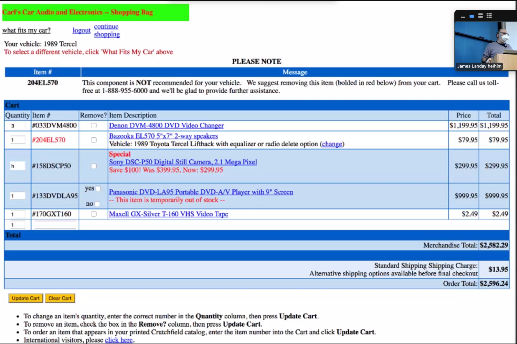
Example of a heuristic evaluation from class.
Here are some heuristic violations:
- Inconsistent colors for text (red vs. black) - H4
- Inconsistent or extra spacing - H4
- Price vs. total doesn’t make sense - H2
- “h” value is accepted into the input - H5
- Yes and no are both checkboxes - H5
- Inconsistent highlighting of table rows - H4
- Black on blue text - H11
- Red font means different things - H4
Summary:
- Have evaluators go through the UI twice
- Ask them to see if it complies with the heuristics, not where it doesn’t and say why
- Have evaluators independently rate severity
- Combine the findings from 3-5 evaluators, come to agreement
Exercise:
- inconsistent colors
- bad color contrasts
- null, unsable
- inconsistent fonts
- no back button
- no system status
- Create message vs. send text - technical language
- Bad font choice: I looks like J
- recognition vs. recall for sending who you are texting
Conceptual Models and Interface Metaphors
Design of Everyday Things
Don Norman is one of the most famous HCI people. Started the cognitive science group at UCSD. He worked at Apple, HP, cofounded Nielsen-Norman Group, and worked at Northwestern University. Currently teaching at UCSD, starting a design lab there.
Design of Everyday Objects illustrates problems faced by designers of systems. It explains conceptual models using examples of doors, washing machines, digital watches, phones, etc. The book includes design guidelines.
Conceptual Models
This is also called a mental model.
People may have preconceived models that are hard to change. E.g. “(4 + 5)” vs. “(4 5 +)”, dragging items to the trash, etc. Interfaces should communicate the model, usually visually or physical or using sound.
Affordances are perceptual clues. Well-designed objects have affordances which are clues to their operation. They are often visual, but not always (e.g., speech). Gibson called this “actionable possibilities.”
“High visibility action buttons”
In 2015, the style of buttons changed into more of a flat design in iOS. Text isn’t considered an affordance. There was a trend in design from 2015 onwards to move towards flat UIs.
Poorly-designed objects have no clues, weak clues, or misleading clues. Signs are indications that a UI isn’t communicating how to operate the interface.
Refrigerator example: solutions can be to (1) make the controls map to the customer’s model or (2) make controls map to the actual system.
There is a design model (the designer’s conceptual model), the customer’s customer model, and a system image. Customers get their conceptual model from prior experience & usage of the new through the system image. Mismatches between the designer and customer’s models cause frustration, bad operation, lower performance, etc.
- CS 194H will be running 1:30pm to 3:30pm on Tue/Fri. Continue the project or join another one to get it to app store quality. Practice design principles individually w/ crit. Slower pace than CS 147, 50% more time per assignment: 1.5 weeks instead of 1 week. Small size with feedback from Landay and a very experienced TA.
Design guides for conceptual models
- Provide good conceptual model: customer wants to understand how controls affect object
- Make things visible: if object has function, interface should show it
- Map interface controls to customer’s model: infix vs. postfix calculator
- Provide feedback: what you see is what you get! (WYSIWYG)
Making things more visible. If it’s not visible, people may get into a “mode error” (on a watch) or may not see all the functionality.
Map interface controls to the customer’s model. Controls should mirror the real-world.
Interface metaphors
A metaphor is the transference of the relation between one set of objects to another set for the purpose of brief explanation. Lakoff & Johnson said that metaphors are “the way we think, what we experience, and what we do everyday is very much a matter of metaphor.” There are many examples in our language. We can use metaphor in UI design to leverage existing conceptual models.
The desktop metaphor suggests a conceptual model. It’s not an attempt to simulate a real desktop but a way to explain why some windows overlapped. It leverages knowledge about files, folders, and trash.
Example of metaphors include:
- Global metaphors: personal assistant, wallet, clothing, cards
- Data and function: to-do list, calendar, documents, find, assist
- Collections: drawers, files, books, newspapers
How to use metaphor…
Avoid a metaphor for metaphor’s sake. Skeuomorphism is “making items resemble their real-world counterparts” or “a physical ornament or design on an object made to resemble another material or technique.
The iPhone’s click-photo is an audio skeuomorphism.
Arguments against skeuomorphism include that it takes up space and leads to an inconsistent look. The argument for it is that it helps people learn. You can include skeuomorphisms until they are learned by the users.
However, metaphors can become dated.
UI consistency
Interfaces should be consistent in a meaningful way, for example the ubiquitous use of the same keys for cut/copy/paste. They should not be arbitrary choices.
Types of consistency include:
- Internal consistency: same terminology and layout throughout the app
- Consistent with other apps: works like MS Word, uses same keyboard conventions, design patterns (across many apps)
- Consistent with the physical world
However, consistency is not always better. For example, the Palm PDA may not have a new and delete appointment in the same place, better choices were reflected in the Palm UIs. Making for mobile may need more breaks from consistency. Consistency helps people learn the interface.
Usability Testing
Why do usability testing?
We cannot tell how good a UI is until people actually use it. Using heuristic evaluations with expert reviewers may not be representative of the target user, i.e. they know too much or not know enough about the target domain. Additionally, it’s hard to predict what real users will do.
Choosing participants
Picking representative target users can include job-specific vocabulary, knowledge, tasks. We can approximate if needed (e.g. doctors and medical students, engineers and students). We can use incentives to get participants via a t-shirt, a mug, or free food.
Ethical considerations
However, usability tests can be distressing (e.g. users have left in tears). Testing and fieldwork can be coercive if there is a power imbalance (e.g., in under-resourced communities).
As researchers we have a responsibility to alleviate these issues with informed consent, avoiding pressure to participate, letting them know they can stop at any time, emphasizing that you are testing the system and not the individual (which is why we say “participant” and not “subject”), and collecting information anonymously. In the context of a university or a medical community, we need to get human subjects approval (IRB).
Designing & conducting the test
A usability test proposal includes the objective of the study, a description of the system being tested, the task environment and materials, participants and recruiting, methodology, tasks, and test measures. With approval, we can run the study and then use the procedures in the final report. Writing these procedures can help us write the report itself.
It’s best not to train users unless it’ll happen in the real-world deployment. Tasks should determine the best design, not vice-versa. Fragmented tasks are those that do not represent a complete goal a real person would do to accomplish the task with our application.
Data can be qualitative (observations) or quantitative (summary of what happened). However, quantitative information cannot provide all the information, missing emotion or the reasons for errors, etc. Bottom-line (quantitative) results require many users to gain statistical significance.
The “thinking aloud” method helps us understand what users are thinking, not just what they are doing (starting with work from Herb Simon and Alan Newell: cognitive science and AI at CMU). Prompts include:
- Tell us what you are thinking.
- Tell us what you are trying to do.
- Tell us questions that arise as you work.
- Tell us the things you are reading.
However, thinking out loud may not always give the right answer which we can try to mitigate with broad questions (e.g., not binary-answer questions). A responder bias is at play where participants want to give an answer (e.g. panty hose study). Accessibility is another important dimension of thinking out loud because of different abilities of participants.
We should only help the participant on aspects of the test that we have pre-decided, keeping track of what people want help on. We also want to record everything and take detailed notes.
Using the results
We want to summarize the data from a usability test by making a list of critical incidents (CIs), both positive and negative, which would include references back to the original data. We strive to also analyze why each difficulty happened. Positive indicidents help us preserve functions that users liked while fixing the negative CIs.
Having collected this information, we want to see what the data is telling us. Based on our expectations, did the users engage as expected? Are elements missing from the experience?
We rate these CIs and the ease of fixing those CIs so we can fix severe problems and also make easy fixes.
Experimental options & details
Situations where numbers are useful include time requirements for task completion, successful task completion rates, and comparing two designs on metrics like speed or number of user errors.
Some measures are easy to record (e.g., time) but aspects like errors or ‘successful completion of tasks’ is more difficult, requiring such definitions made in advance.
Combining thinking-aloud with quantitative measurements can slow down the interactions.
Between groups, within groups.
- apple hci guidelines
Experience Prototyping
Courtosey of Kristina Inoyue.
We want to focus on assumptions that are unknown to be true and are vital for the user experience. These are the critical assumptions to actually test with participants.
Experience prototypes are made to test assumptions to guide future development. These tools are like running a controlled study where one variable may be manipulated for the participant. Future development is guided by insights from experience prototypes.
Accessibility
Courtosey of Jianna So.
Social Model of Disability
Ableism is a system of oppression that favors being able-bodies/able-minded, frequently at the expense of people with disabilities. Stacey Milbern.
Goal: collective empowerment and liberation is the goal.
Inclusive design practices:
- assistive or ability based design for a specific task or ability
- accessible/universal design, usable by most number of people
Social model => assistive
WCAG 2.1, A to AAA, ADA compliance. Netflix was suited for captioning of songs:
POUR: Perceivable, Operable, Understandable, Robust
- Perceivable: design for small screen size, use space as an element, account for zoom/magnification (lens under finger), color contrast: at least 4.5:1, best is 7:1 (larger text with more spacing is more readable, allowing for less contract
- Operable: keyboard control, touch target (9mm x 9mm), easily accessible buttons, non-touchable space around them, one hand vs. two hands, holding the phone in different ways, iOS height control
- Understandable: consistent layout, position important elements above the fold, clear actionable elements, avoid dependency on font styling, include labels, instruction & hints
- Robust: virtual keyboard, easy methods for data entry, avoid/minimize key entry when possible
VoiceOver design principles:
- ALL elements are reachable and labeled
- Elements have a coherent swipe order
- Label heading text with “headings” to help users easily navigate and explore the app
- Implement actions on interactable elements
- Add accessibility “hints” to clarify and describe element’s role
This site is open source. Improve this page »